
Empowering Financial Freedom With Defynance
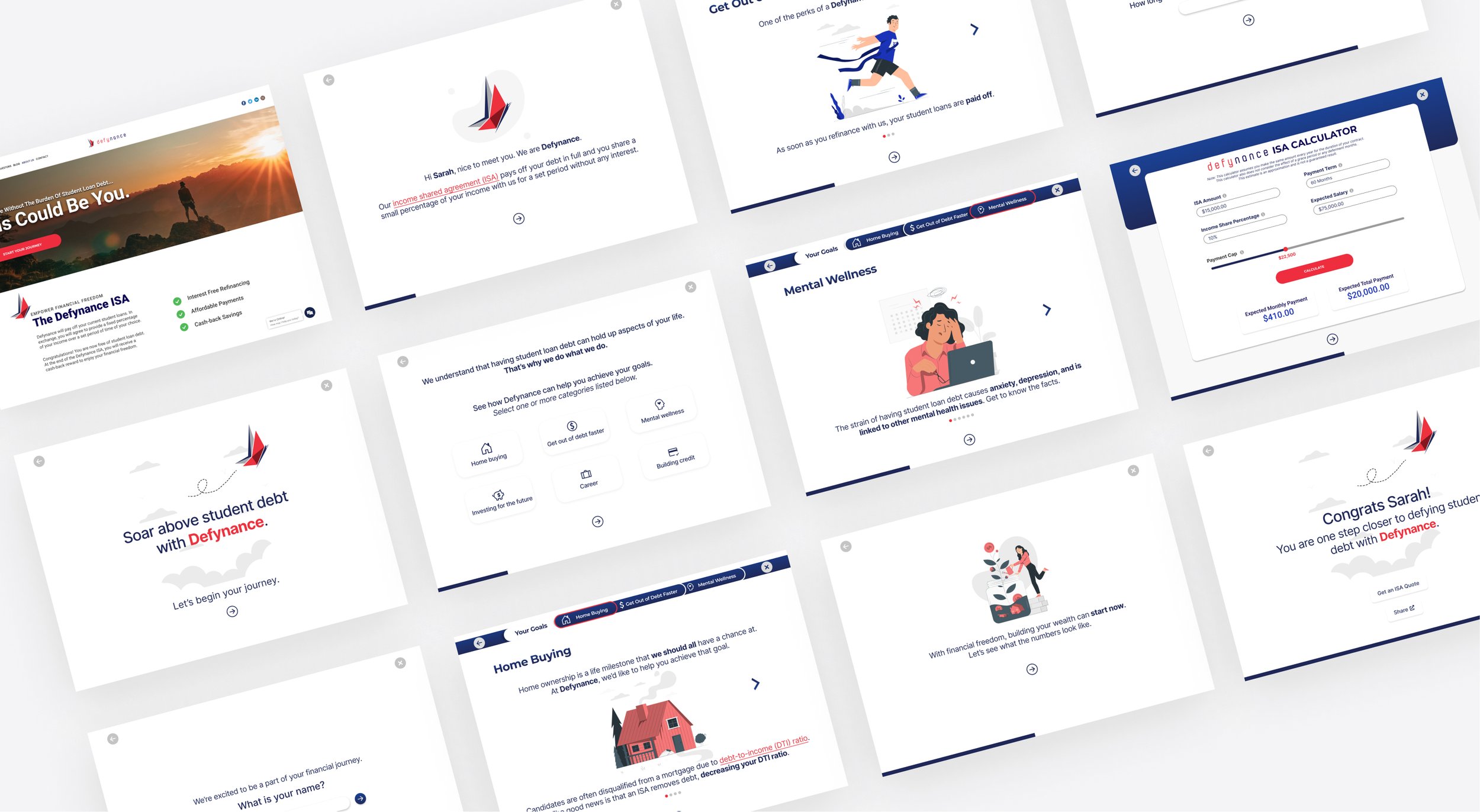
The Defynance Lifestyle Journey Tool for Defynance’s existing website. Educates the users about Defynance and their ISA program and helps them envision how they can benefit from switching over, and helps Defynance obtain more qualified leads.
November 2021
Project Overview
I worked with 3 other designers, Darnell Baker, Anthony Mengesha and Kyle Peterson, on this project for Defynance at General Assembly SF. I worked as a UX/UI designer, communicating with the client, conducting research and synthesis, defining the problem, brainstorming design solutions, and implementing them in the final prototype while keeping our deliverables and schedule in check with everyone throughout the whole project.
This is a client project.
Team
Minji Lee
Darnell Baker
Anthony Mengesha
Kyle Peterson
Duration
3 Week design sprint
Communication Methods
Daily pulse check and next steps with teammates
Shared written and design documents
Worked together on Zoom for real-time communication and collaboration
Trello
Design Tools
Figma
Zoom
Slack
Pen & Paper
Design Process
Business Analysis
User Interviews
Affinity Mapping
Persona Development
Competitive & Comparative Analysis
Design Studio
User Flow
Wireframing
Prototyping
Usability Testing
Design System
Our Client
Defynance Needs More Qualified Leads

“Defynance eliminates your student debt, frees you from compounding interest, and empowers your financial freedom with our smart Income Share Agreement (ISA)”
-Defynance
Defynance offers a refinancing program called Defynance Income Share Agreement (ISA), which pays off your debt in full in exchange for a small percentage of your income with them for a set period without any interest.
Defynance needs an online tool for their website that …
Educates the users about Defynance and their ISA program
Helps them envision how they can benefit from switching over
Eventually would help Defynance obtain more qualified leads
The Problem
Sarah Says…

“I was only 18 when accepting my student loans and had no sense of financial literacy - now the compounding interest has me in what seems like perpetual debt.”
-Sarah Jefferson, 30, School Teacher
Frustrations
Wishes someone could have helped make her informed decisions.
Interest is high and keeps growing.
Not being properly explained what certain financial jargon meant.
Goals
To be able to refinance or consolidate her student loan debt into better payments.
To fully pay off her student loans within the next 5 years.
To be able to inform her students and children about student loans and how to make more informed decisions.
Sarah needs a way to easily access and understand personal finance information because she needs better guidance when applying for refinancing services so that she can make educated decisions.
The Problem
Mike Says…

“My student loan debt has held my life back. I was sold on a dream that’s proven to be a total lie.”
-Mike Singh, 43, Physician
Frustrations
Believes the lending company was deceitful.
Student loan debt has prevented him from achieving financial stability.
His loan plan is not based on his income.
Goals
To fully pay off his student loans within the next 5 years.
To start new savings account for his kids’ education.
To get mental health resources for his anxiety over his financial struggles.
Mike needs a reliable and transparent source about student loan refinancing so that he can learn about the implications alternative methods have on helping him get out of debt and save for his family’s future.
Our Approach
Meet The Users Where They Are

We started defining which key aspects to focus on, based on the users’ and Defynance’s needs.
HMW educate users about how an ISA works in an interactive and non-intimidating way?
HMW allow users to see how refinancing their student loans might impact different areas of their life?
HMW build trust with users looking for a different option for paying for their student loans?
HMW create a user journey that financially educates users and simultaneously builds a profile that helps Defynance gain more qualified leads?
HMW personalize the experience and make it engaging but also keep the process simple?
Our Design Mission
We believe that creating an engaging and interactive lifestyle tool will help guide users through learning how they can benefit from the ISA as a solution to both our users, while helping Defynance obtain more qualified leads.
Our Process
Identifying Opportunities To Stand Apart

Competitive Analysis
How can the lifestyle tool help differentiate Defynance?
On the whole, most of the competitors relied on informative text, but there’s room to grow.
Interactive estimating tools
Data visualization
Tooltip
Key statistics

Comparative Analysis - Effortless Journey
How can we take the user through completing a task without challenges and unanswered questions?
Clean, simple UI
Clear, straightforward navigation
Tips and help features throughout

Comparative Analysis - Easily Digestible Information
How can we present information to the users so they have a clear understanding of certain concepts, processes, etc.?
Simple explanations of complex jargon and concepts
Concise copy
Engaging visual representations and illustrations

Comparative Analysis - Personalization
What aspects of the product can be personalized so the users feel it’s catered to them?
Language directly address the user
Elements of delight
Flow dictated to some degree by the user
According to Forbes, 80% of customers are more likely to buy from a company offering a personalized experience.
Process and Insights
Sketching It Out

Visualizing ideas and sharing our throughts
Multiple team ideation sessions
Design studio with 3 additional UX designers
We found it important to keep in mind to…
Prioritize simplicity
Avoid over-personalization that can be misleading and not inclusive
Draw the line between delightful and not trustworthy
Design Approach
Making It Flow

Introduction: Starting The Conversation
Setting the tone
A little bit about you, a little bit about us
Life Goals: Connecting Back To Research
Educating users on how they can benefit from Defynance with what they are hoping to achieve
Envision: Showing Users The Numbers
The calculator tool to help users get an idea of the financial outcomes
Real Results: Meeting Business Goals
Generating qualified leads by asking loan questions and asking for email
Design Deliverables
What’s Working Or Not Working In The First Iteration?
Because we were in a unique position where we were creating a relatively simple tool from scratch under tight time constraints, we began designing one version of the tool in mid-high fidelity.
We tested our initial prototype with 5 users currently paying or had paid on student loan debt.
Areas to improve:
Navigating through the Life Goals section could be more intuitive
A lot of white space on screens that aren’t connected to life goals
Would like to know the purpose of the loan questionnaire and email
Red text color in some areas gives a negative feeling
Positive affirmation:
The tool was informative and the animations helped keep engaged
They could trust the website and company based on the look and feel
The tone and mood of the journey was supportive and reassuring
The overall feel of the tool helped to make it feel okay to deal with mental health issues that accompany student loan debt
Imagery and illustrations made them feel happy and engaged
Journey felt personalized because they were able to choose goals that specifically appealed to them.
After conducting an affinity map with the insights, we discovered 4 key areas of our design that we needed to focus on and ultimately made 20 or so moderate refinements to our concept design.
Design Deliverables
We Listened.
Some key modifications include the Life Goals navigation, and copy on the page where the users are asked to provide their email.

Life Goals Page Painpoints
Navigation was not clear with the different arrows
No correlation between life goals bar and actual goals user selected on the previous screen
The placement of the bar seems congested with other elements
Resolution
Refined design of progress bar to incorporate labeling of goals
Adding a title to the bar to define the displayed sections are what the user chose on the previous page

Email Page Painpoints
Multiple users stated that they did not see the purpose in providing an email address
Stated that it would be good to know what the email address was being used for and any privacy details
Resolution
Made the verbiage more personal and conversational and trustworthy
Provided a reason for the email address request
Emphasized the “save and continue” button by changing the default text color to branded blue, highlighting the main call-to-action
Design Deliverables
The Simple But Effective Details

Build A Tool The Users Trust
We wanted the journey to feel friendly and empathetic, so the tone of the copy was really important. So we continued the conversational tone throughout the whole process.
Keeping with the brand identity was another key UI design decision. We used the brand colors and look and feel to make this feel like a part of the existing website and brand. The look and feel are clean so the content is not overwhelming as well.

Create A Personalized Journey
Personalizing the journey was important, because customers will have different financial backgrounds, needs, and goals, and we wanted to make this journey feel like it’s catered to each person.
Through our research, we defined some of the user’s goals and how they could benefit from switching over to Defynance. We created the life goals page where users can pick some of the goals that resonate with them. Also, the ISA calculator shows them estimated numbers, which will help them decide if switching over to the Defynance ISA is right for them.

Educate And Inform Users In An Interactive Way
Making this tool educational and informative, while not overwhelming the users with too much information was important as well.
We included hoverable tooltips to educate customers on some financial jargon. Breaking down these types of information that could be intimidating was another way to support the customers with different knowledge backgrounds.
Also providing Defynance specific resources such as the Resource marketplace will help customers feel that Defynance is there to help and protect them along the way.

Meet Business Goals
And of course, to meet Defynance’s goal to obtain qualified leads, we included some non-threatening loan-related questions for Defynance to collect, as well as their email for retargeting campaigns. So the tool is not only to meet user needs but also to achieve Defynances’s business goals.
Reflections
A First Positive Step Forward
What’s next?
We’re excited for the potential this tool has for Defynance and its mission to revolutionize student loan debt.
In the case where this tool gets implemented, there are a few things we’d like to do.
We’d like to conduct more usability testing, so we can learn more about what’s working and what can be improved, and continue making this tool better.
We’d like to also meet with the marketing team to discuss how we can optimize this tool for marketing campaigns. For example, we could suggest that sharing a link to this tool with other people can get users 1 more month of the grace. Like an incentive program.
We’d like to also meet with the development team to discuss any technical capabilities and limitations.