
Enhancing The Online Shopping Experience For The Local Customers
An improved eCommerce website for the West Seattle Nursery & Garden Center, showcasing their highly curated products while maintaining their brand image: “Small Shop” appeal and great customer service.
October 2021
Project Overview
The challenge for this project was to redesign an existing garden center website into an eCommerce site. I was provided with a target user profile, the business’s needs, and the list of their store inventory.
This is a spec project.
Team
Minji Lee (solo project)
Duration
2 Week design sprint
Design Tools
Figma
Zoom
Slack
Optimal Workshop
Pen & Paper
Design Process
Business and Persona Analysis
Affinity Mapping
Competitive & Comparative Analysis
User Flow
Open Card Sorting
Wireframing
Prototyping
Usability Testing
The Problem
The Owner Says…
“We built our own website but we’re not pleased with the results. We have plenty of website visitors yet few completed purchases.”

The West Seattle Nursery & Garden Center has been serving its local community since 1983. For over 30 years, they dedicated their efforts to maintaining a highly curated range of quality products, and great customer service. They wanted to do more for the local community, so they built an e-commerce site to offer online shopping.
But their online visitors are not completing their purchases, because their current website is mostly informational, so they are looking for opportunities that could help with making sales and showcase their great products while maintaining their small shop appeal.
The Problem
The User Says…
“I take my time to look at many options when I’m shopping, but I find it to be a hassle because there’s no good way to compare multiple products at once.”

Maddie is one of their regular customers who already love their shop but is frustrated with their new website.
Since the quality of the product is the most important to her, she looks out for information about materials and manufacturing standards and seeks out familiar brands she already knows are great.
She likes to thoroughly compare multiple products before making a purchase, but since there’s no efficient way to do that, she has to go back and search for previously viewed items.
She refers to other people’s reviews and often writes her own. But when she’s browsing, she’s not interested in seeing low-quality, low-rated products.
Empathize
Aiming To Enhance The Site To Enable Smooth Checkout, Browsing, And Product Comparison Experiences
I started thinking about ways I could …
Make the most popular/highest-rated products easily accessible
Make comparing multiple products the most exciting part of the shopping process
Cater to the user’s behavior of taking a long time to make a decision
Help the user feel confident in their choice of product and its quality
A standardized and recognizable check-out process, but lacking the ability to compare products

Competitive Analysis - Task Analysis
The task analysis of the checkout process within these competitor garden center websites gave me a clear picture of a typical process from browsing products to submitting an order.

Competitive Analysis - Feature Inventory
The feature inventory analysis revealed that most of the features users come across during the checkout process on these garden center websites are standardized features that they would already recognize, and are familiar with using, such as keyword search, rate, review, and add to cart.
One area that the majority of them could benefit from was the functionality for comparing multiple products.
How are the other e-commerce sites empowering users to compare products?

Comparative Analysis
Websites such as Apple, Google Shopping, and Home Depot Garden Center have the ability to see snapshots of product details side by side.
These websites all successfully highlight the basic information like photos, name, brand, price, and specification for easy comparison.
Define
Multiple Clear Ways Of Locating Specific Products, And An Efficient Way Of Purchasing Products
The two key tasks users need to be able to intuitively perform are comparing multiple products, and selecting products to complete the checkout process, which are demonstrated in these simple user flows below.

User Flow 1 : Compare Multiple Products

User Flow 2 : Complete Check Out Process

To be able to seamlessly map out the navigation of those user flows, I created this simple site map and organized the content of the website, so that the user is intuitively led to browsing products, then to completing the purchase.
I focused on minimizing steps to get to the final destination allow users to select and purchase items more efficiently.
I also conducted open card sorting with 5 participants on Optimal Workshop to see how users might categorize and label the store’s inventory list. I was able to find the trends in inventory groupings, and narrow down about 70 items into 6 main categories, to help users locate specific products easily. They are listed under “Products > Categories”.
Ideate
From Entering The Website To Completing A Purchase
These initial sketches and wireframes illustrate the main steps users would take to purchase an item.
The user would enter the website, browse categories and products, read through product details, add it to favorites, choose from favorites to compare, add items to the cart, and proceed to checkout.

Sketches

1. Home Page

2. Product Search Page

3. Product Details Page

4. Favorites Page

5. Cart Page

6. Shipping Info Page

7. Payment Info Page

8. Order Confirmation Page
Prototype, Test, Iterate
Overall Easy Flow, But With Some Pain Points
I conducted 5 usability testings to get feedback on the flow of the website, and some of the key takeaways were that
Someone who likes to read all the details of a product may want to see all of the details laid out, instead of having the longer text collapsed.
Adding an item to favorites was easy, but figuring how to get to the My Favorites page was not intuitive.
This was a critical error because getting to the favorites page is key to getting the user to where they can compare multiple products.

To accommodate those issues, I started making some revisions to my high-fidelity prototype.
The product details page now has all the details laid out,
And the icon for my favorites is on the header next to the cart. This allows users to access their favorite items efficiently, no matter where they are on the website.
Prototype, Test, Iterate
The Thoughtful Research-Based Design Makes A Website Without Obstacles
Some of the key design decisions are illustrated in the images below.

Home Page
For readability and simplicity, I picked lightweight typefaces (Barlow and Lato) and a color palette and that is natural but also accessibility tested.
This homepage simply highlights the main features like products and categories, my favorites icon, and the shopping cart, which sends a clear message to users that they are here to buy things.
And the softened corners and round shapes emphasize friendliness and the ‘small shop’ appeal the owners want to maintain.

Product List Page
The placement of suggested products at the top makes them highly visible and easily accessible, hopefully leading to more sales.
Having the recently viewed items on the side helps the user easily navigate back to anything they want to get a second look at.
When the products list populates, it’s sorted from highest rated to lowest as default. This helps users not to see low-rated products and eliminate unnecessary steps to get to the desired products.

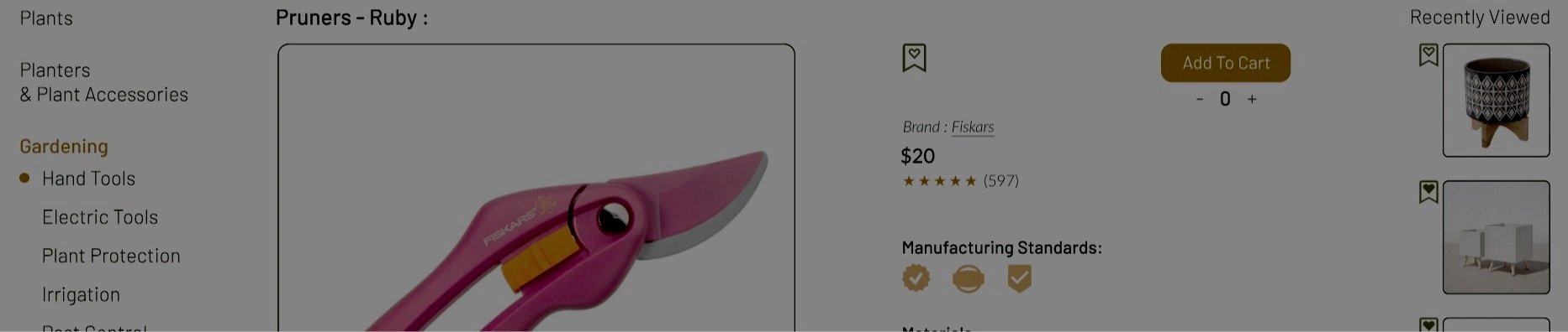
Product Details Page
Breadcrumbs and sidebar let the users know where they are on the website,
And the product details portion highlights information that relates to the quality that Maddie would want to see.

Favorites Page
The favorites section has add to cart buttons for each item, which eliminates the need to go back to each product details page to add to the cart.
You can drag and drop items from the favorites up top to compare the chosen items side by side.
This simple interaction can help engage the user even more in this process.
Reflections
There’s Always Room For Improvement
Simple is best, but not always the easiest
Keeping the content visuals and navigation flows simple while keeping all the necessary components was challenging, especially keeping the ‘small shop’ appeal in mind.
What’s next?
I would like to revisit some of the UI design issues, like the spacing of sidebars and the main body of content.
I also want to explore where I can clearly implement the notion of ‘delight’, and the hook model, so the users would want to keep coming back.
For example, an incentive program where if you leave x number of reviews, you get 30% off.
I started sketching out some ideas for the mobile app version of the site, and I’d like to deep dive into some of the responsive design concepts, like column drop and layout shifter.
